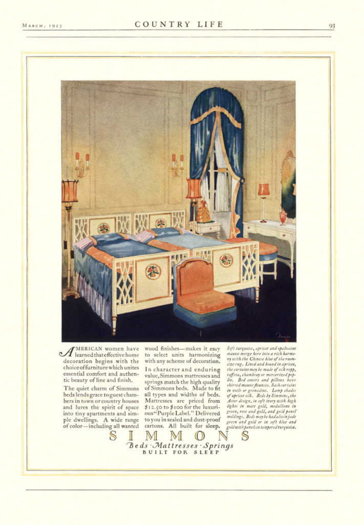
Young & Timmins: Early Ads (1923)
Once established, Young & Timmins hit the ground running, creating a number of ad series that were published in 1923. Harry did the illustrations for many but not all of these early series. This page presents examples of early Y&T ads that are not presented on dedicated pages (e.g. the Pierce-Arrow auto ads).
From an aesthetic standpoint, Y&T ads demonstrate the synergy between illustration, lettering, and layout. A compelling ad requires skill and experience on all fronts (plus good copy). A strong illustration alone can seldom carry an otherwise mediocre execution. The reverse is true as well. I imagine that both Young and Timmins realized this, and recognized each other’s talents, when they established Y&T.
The timing of Y&T’s formation was fortuitous relative to developments in the magazine world. Beginning around 1922, color was gradually utilized more, particularly for ads. What I term ‘the aristocratic glossies’ (e.g. Country Life, House & Garden) and some of the women’s magazines (e.g. Ladies’ Home Journal) used a fair amount of color prior to 1922, again particularly for ads. By contrast, in The Saturday Evening Post, the omnipresent Campbell’s soup can was printed in black and white until 1922 – only the cover and precious few other pages got color treatment. The same was true for other mass magazines at the time (e.g. Collier’s, The American and Good Housekeeping), and important niche magazines as well (e.g. The Literary Digest). As a general statement, the Y&T ads look better and are more compelling in color. A century later, I for one am thankful that much of the Y&T material was published in color, at least in some magazines.


